Blog Layout Fundamentals: The 4 Elements You Can’t Skip
Blogging is just writing some stuff, right? Wrong. Blogging is the foundation of a great content strategy. And with it being THAT (yes, THAT) important, getting the blog layout right is crucial. The layout can be the deciding factor for a reader to take your B2C (or B2B) relationship to the next level.
Your business may not be your blog, but your blog is definitely your business. So you’ll want to make sure that your posts are sending the right message, and fulfilling their purpose.
In this article, we’ll break down four major components of a successful blog layout that will catch attention, guide the reader’s eye, create an effortless read, and have a lasting benefit to both parties. The four components are:
- Headline
- Visuals
- Body
- Summary and CTA (call-to-action)
1 – Headline

Your title is your first impression. In fact, it may be the most important part of the blog layout. Will they or won’t they continue further?
You want your title to be eye-catching and informative. CoSchedule’s Headline Analyzer (affiliate link) quantifies that by looking at word balance, scannability, and sentiment.
CoSchedule suggests that the word balance should fall into these four categories:
- Common words – These should account for 20-30% of your headline and are the building blocks of your title.
- Uncommon words – These are the words that create the substance in your title, and should only take up 10-20%. They are extremely important for content.
- Emotional words – 10-15% of your words should create an emotional response, this increases CTR (click-thru rate).
- Power words – These words are the cherry on top. They show readers can trust you and prompts them to take action.
CoSchedule’s Headline Analyzer also rates scannability by taking length, first and last words, keywords and even gives you a web search preview. These can be great tools to help you see what your reader will see and adjust accordingly.
2 – Images
How can you use imagery to lock the reader’s eyes and keep them scrolling? There are a few ways to do this:
- Use an infographic. Users are looking for information, why not give them a little snippet of your topic and dive deeper “below the fold” in the blog/article?
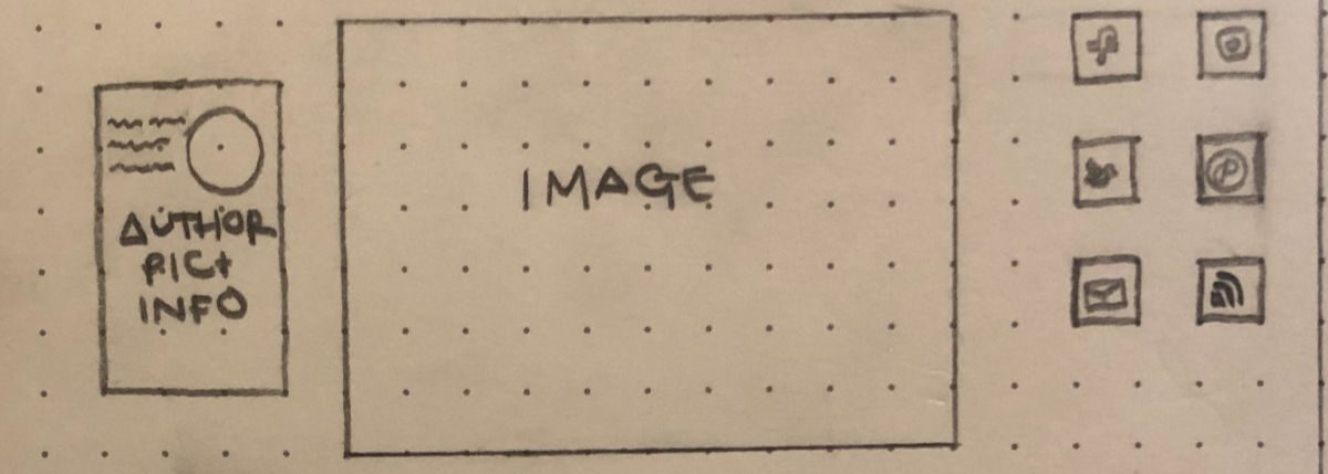
- People. People can create an emotional connection and give a headstart on how your post is going to make you feel. People will also be drawn to where the eyes are looking in the picture so make sure you have something important in their eye line.
- Show them how it’s done. Insert a screenshot of the actionable step you are looking for. If they see how it is done or how easy it is they will be more likely to do it themselves.
You want to make sure your images are strategic so stay away from random pictures of inanimate objects and use visuals that will inform them, create an emotional connection, and bring their eyes to your main points. Just be careful, use images that are approved for public use. ProBlogger has some great guidance on how to find and use images legally.
3 – Body
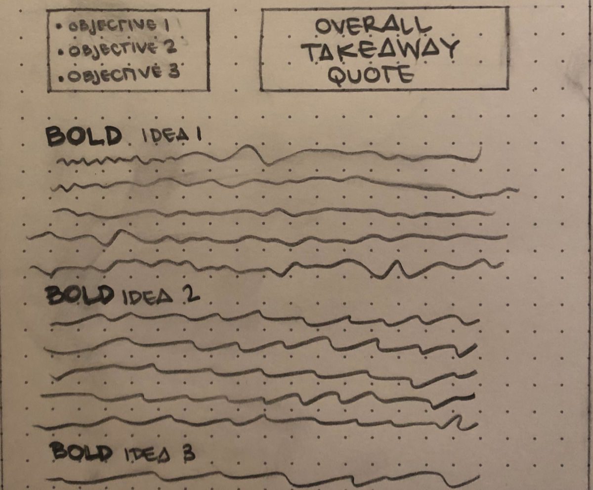
How many times have you gone to an article and skimmed just to find the information you need and left because you just saw a wall of words? Probably a lot, and your readers are no different. Let’s look at two helpful elements for the body of your blog layout:
TLDR; (too long, didn’t read)
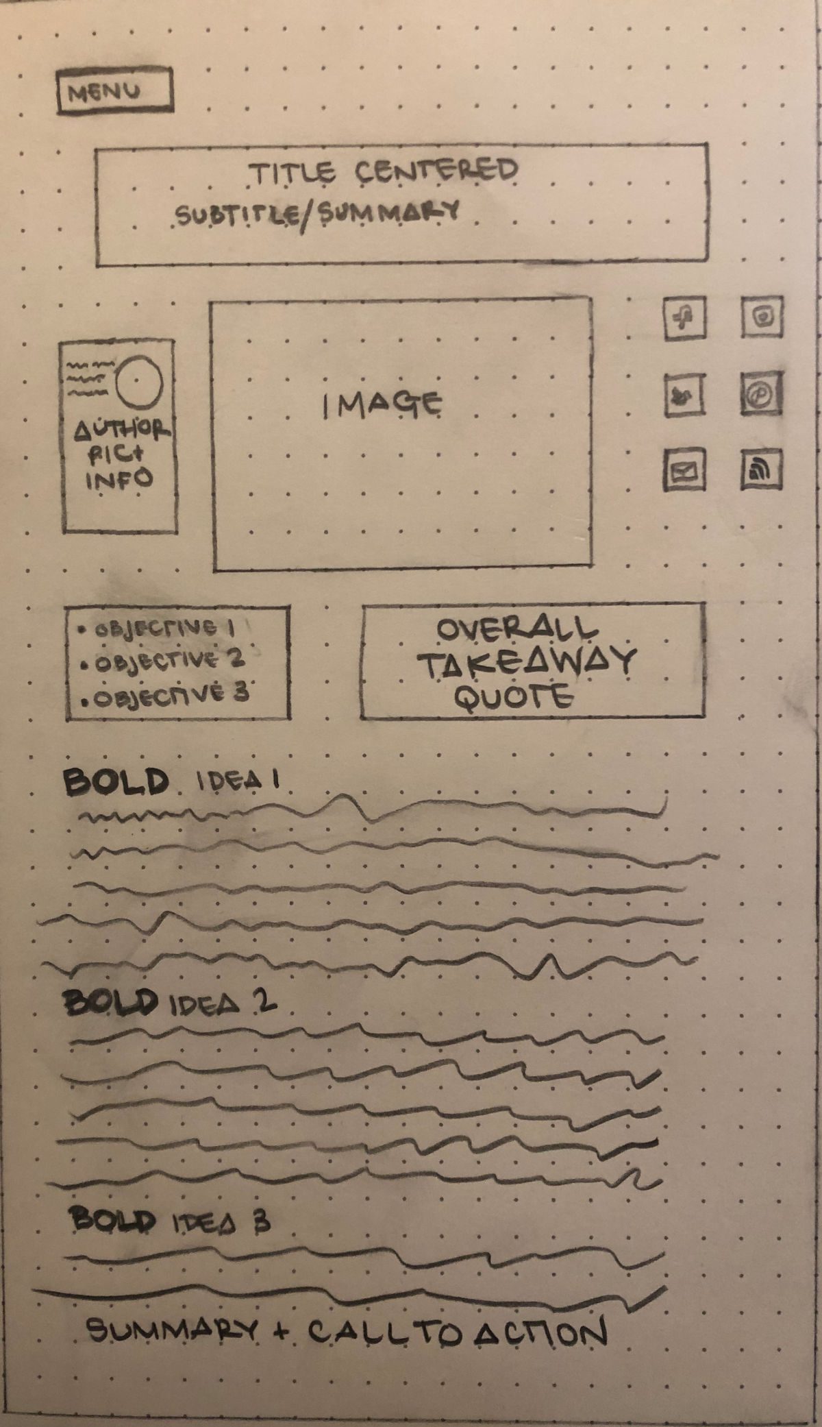
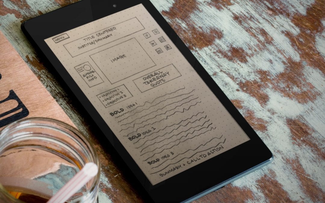
From your subtitle to your images, there are a few ways to use this to your advantage.
- Your subtitle should be a one to two sentence summary of your post.
- Under your image, you can bullet point your main points so they know what they will find before they scroll.
- Bold headlines and important sentences to create clean and concise readability.
- Add some pattern interrupt to the page with larger type and an option to share.
- Summarize the article with your call to action so even if they don’t read the whole article they will opt-in to learn more.
Visuals
We discussed images and how they can draw the reader in your blog layout. These next visual elements keep the eyes moving down the page smoothly to increase session duration and engagement.
- Bolding elements like headlines, bullets, and keywords can neatly break up text and help you reiterate the importance of the text.
- Bullets segment individual ideas so the “skimmers” know where to stop and find information vs. seeing a wall of text and bouncing.
- White Space is crucial for readability. I am going to be really cliche here, but less really is more with this one. By that, I mean less hustle and bustle going on as you scroll will benefit you more than trying to fit every bit of information to fill spaces on the page. Just don’t go too hard on the white space or your page will look incomplete.
4 – Summary and CTA

If you laid it all out in the beginning and your formatting is well done, you shouldn’t need a summary because they will have already gotten what they needed from your article throughout.
What you do want is a quick call to action whether you want to get them excited to see you in their inbox, or follow you on social, you want to make it clear, concise, and easy to do.
Limit your social icons to three, send them over to your site via a link to increase your referral traffic, or get them to opt-in to your emails. You can use these call to actions to increase different metrics but that is a whole different topic!
Final Thoughts on Blog Layout
The most important thing to think about when putting together your blog post is the reader experience. And that means thinking about the structure, and not just the words on the page. Providing a great user experience will improve engagement levels on your site, which is exactly what you want.
With blog layout and technical structure being so important, you may also want to scan your site for any technical issues. Use our (completely) free webpage audit tool to see how well you score. This doesn’t scan the layout, but it will give you a good idea of the technical strengths and weaknesses of your page.
Now, over to you… what are some of the best practices you’ve seen in blog posts that you read? What are some key takeaways that you can use to improve your blog layout right now?
If you’re working on your blog and want to take it further, the AI Author Lab is built for writers and bloggers who want to use AI to grow their platform, create content more efficiently, and build a blog that actually works toward their goals.
